The Stone Technologies™ logo is the most prominent visual representation of the organization in all instances and should be presented consistently and accurately to build recognition of the brand and effectively reflect the company’s image and identity.
In the included folder you will find sub folders containing .svg/.ai/.pdf files .jpg and .png files. If a vendor requests vector art/Illustrator/high resolution files, supply the .svg/.ai/.pdf files. If they request raster art, .jpg, or .png, supply them with the .jpg and .png files.
The main elements of the STONE identity are pictured here. This includes the primary full-color logo, black logo, secondary color options, Fabrication & Installation logo, Technologies logo, and icons. All artwork must be constructed from reproduction-quality art or from high-resolution digital files.
Fabrication & Installation Logo
Technologies Logo
Icons
Section. 2 - Identity Usage
Safe Space
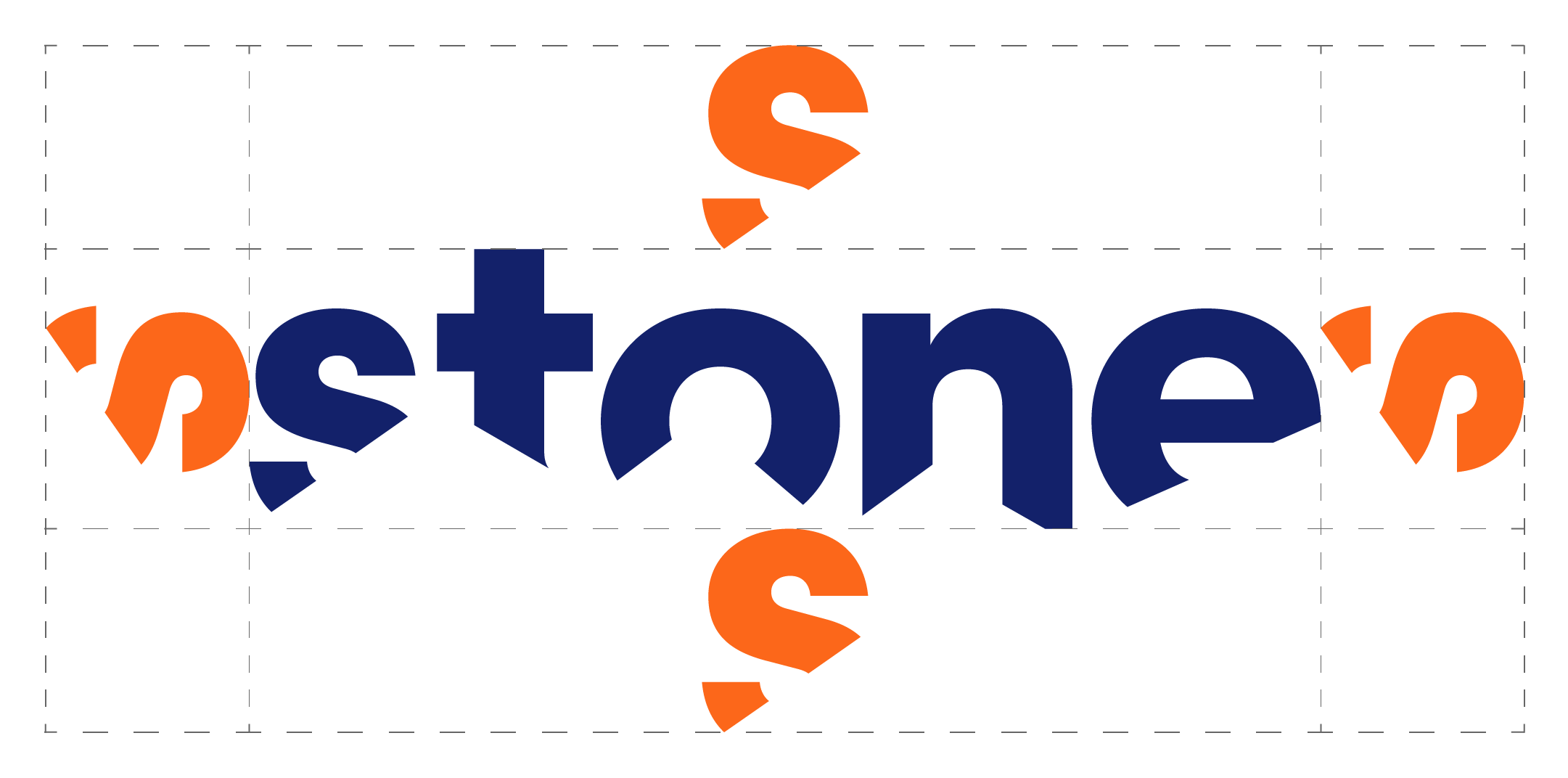
Each aspect of the identity must be treated properly as it is applied to design. Pictured right are the guidelines for safe space when utilizing the logo lockup. The space surrounding the logo should never be smaller than the height of the S.
Misuses
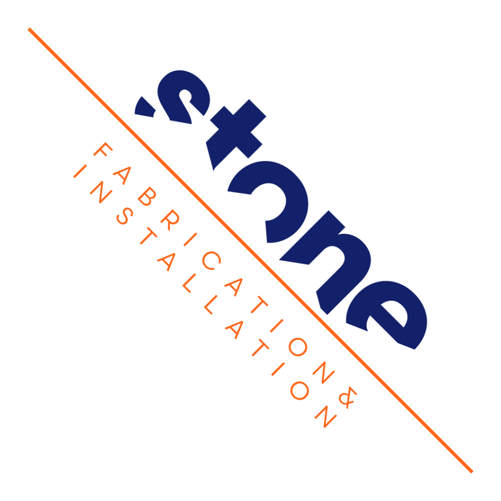
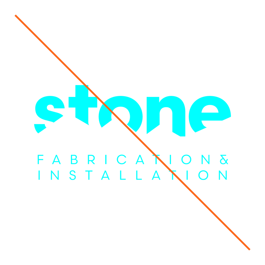
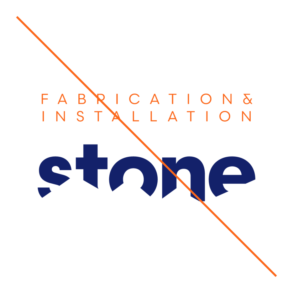
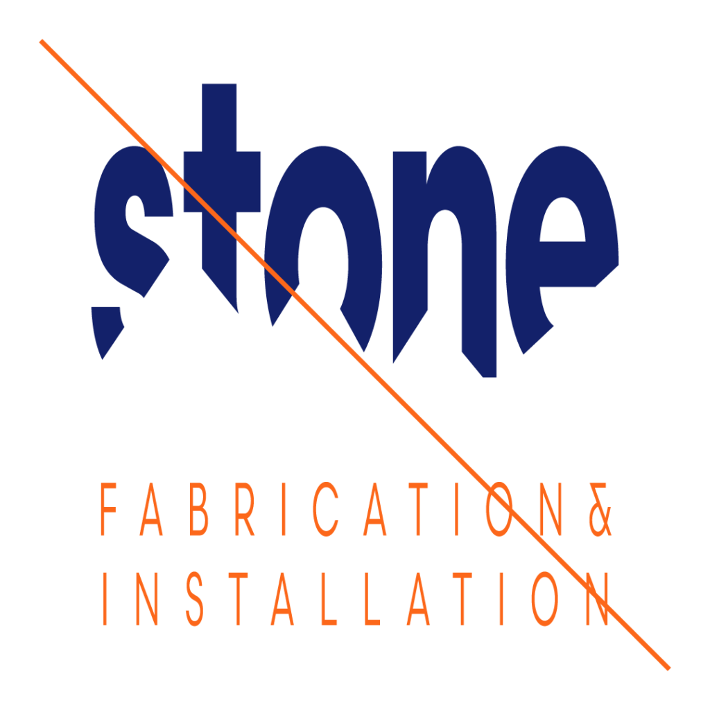
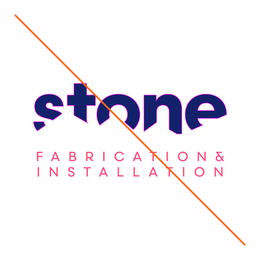
The STONE logo should always be used in its original format or under the guidelines given. Never should the logo be treated in one of the methods shown here.
EMBELLISHING
ROTATING
ALTERING PROPORTIONS
NON-DESIGNATED COLORS
NON-DESIGNATED COLORS
REORDERING ELEMENTS
DISTORT OR SKEW
ADDING STROKE
LAYERING ELEMENTS
Section. 3 - Typography & Color
Typography – Primary
Scandia – Bold
Shown here is the primary typeface for STONE. Utilization includes primary headlines only. The only acceptable weight for Primary uses is bold.
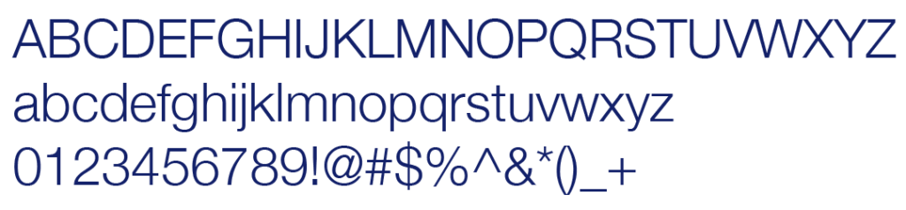
Shown here is the Web typeface for STONE. Utilize for web applications that don’t support Scandia. The only acceptable weight for Primary headlines use is bold. The only acceptable weight for Body use is light.
Shown here is the main color palette for the STONE brand.
The colors should never be used outside of the values shown here. When utilizing a logo file, check to make sure that the color profile is appropriate given the usage. The following shows each color profile’s appropriate use:
CMYK: Offset Process Printing, Digital Printing
PMS: Offset Process Printing, Screen Printing – Learn More
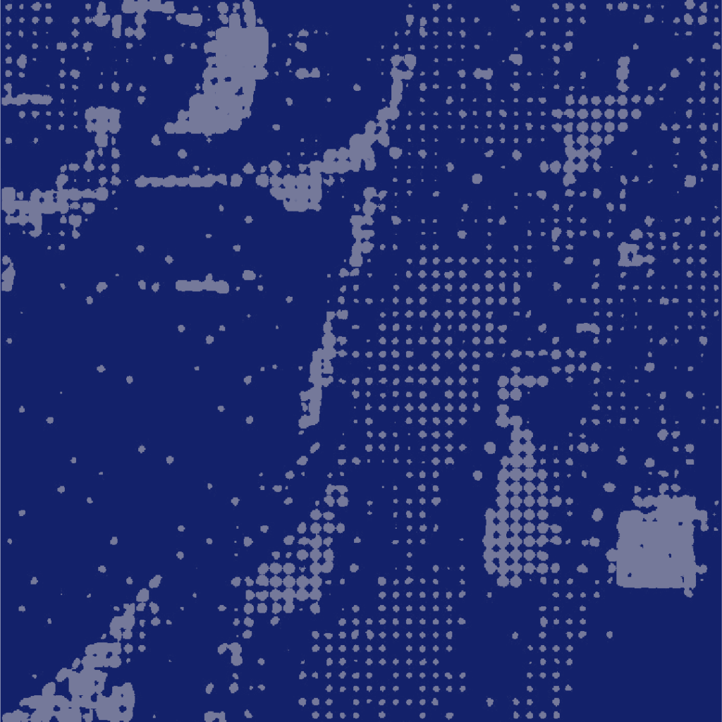
Shown here is the background texture for the STONE brand.
Always use the STONE brand texture only in Pantone Warm Grey 1 at 50% opacity. Do not change the colors or opacity.
The texture can exist on white, or blue backgrounds. It can also exist underneath a layer of Pantone Warm Grey 1 with a multiply blend mode. Do not place on any other colored background.
The texture file should always have at least a height of 8.5 inches for print, or 2000px for digital use. Crop/mask the texture file to fill space at the correct scale. The file can be scaled up, but not scaled down. Do not make the details smaller.
The texture file can be rotated 180°. Do not rotate to any other degree.
The STONE texture should always be used in its original format or under the guidelines given. Never should the texture be treated in one of the methods shown here.