LOGO GUIDE
The Eddy House logo is the most prominent visual representation of the organization in all instances and should be presented consistently and accurately to build recognition of the brand and effectively reflect the company’s image and identity.
In the included folder you will find sub folders containing .pdf files .jpg and .png files. If a vendor requests vector art/Illustrator/high resolution files, supply the .pdf files. If they request raster art, .jpg, or .png, supply them with the .jpg and .png files.
Section. 1 - Logo Guide
Primary
The Eddy House primary logo is horizontal, showcasing “Eddy” in bold uppercase lettering, with “House” vertically aligned at the end. All artwork must be created from reproduction-quality art or high-resolution digital files.
Secondary
The Eddy House secondary logo is stacked with the vertical “House” on the right-hand side. All artwork must be created from reproduction-quality art or high-resolution digital files.
Square Icon
The Eddy House square icon includes the stacked Eddy House secondary logo inside a square. The square should always be primary purple with white lettering. All artwork must be constructed from reproduction-quality art or high-resolution digital files.
Round Icon
The Eddy House round icon includes the same stacked Eddy House secondary logo inside a circle. The circle should always be primary purple with white lettering. All artwork must be constructed from reproduction-quality art or high-resolution digital files.
Section. 2 - Identity Usage
Safe Space
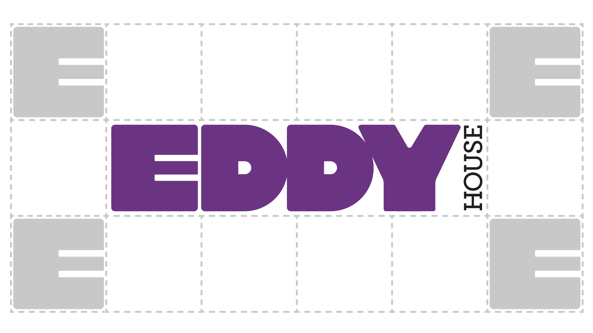
Each aspect of the identity must be treated properly as it is applied to design. Pictured right are the guidelines for safe space when utilizing the logo lockup. The space surrounding the logo should never be smaller than the height of the “E” in Eddy.
Misuses
The Eddy House logo should always be used in its original format or under the guidelines given. Never should the logo be treated in one of the methods shown here.
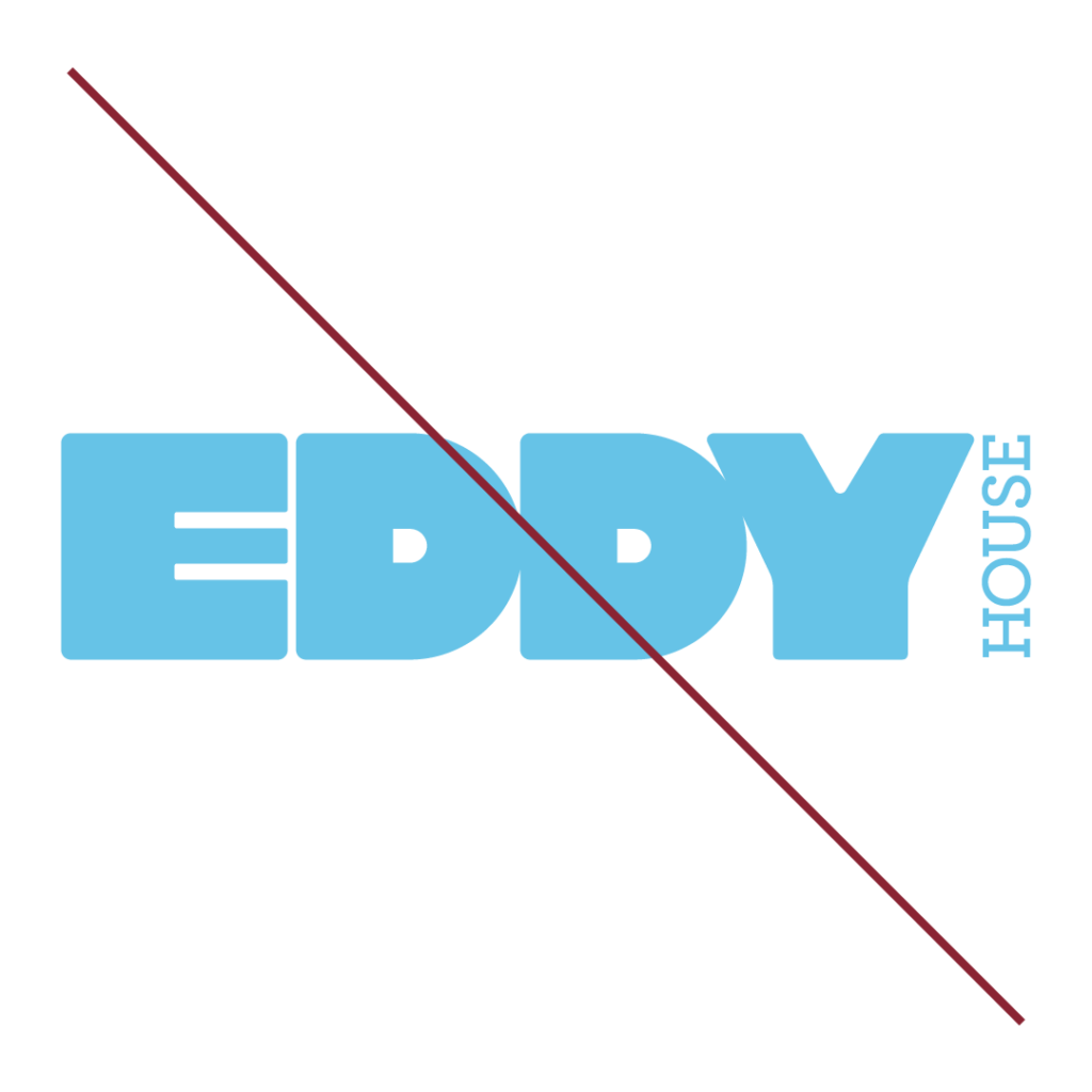
MISUSE COLORS
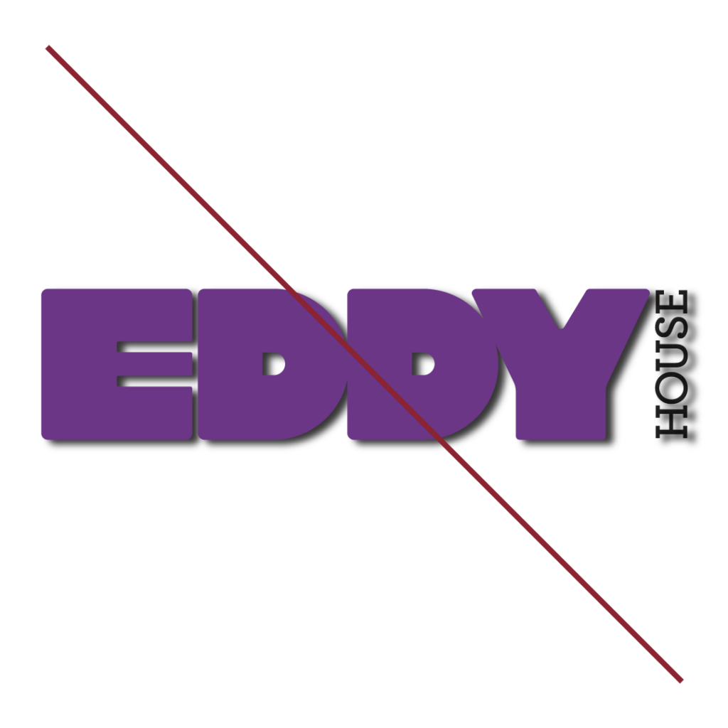
DROP SHADOW
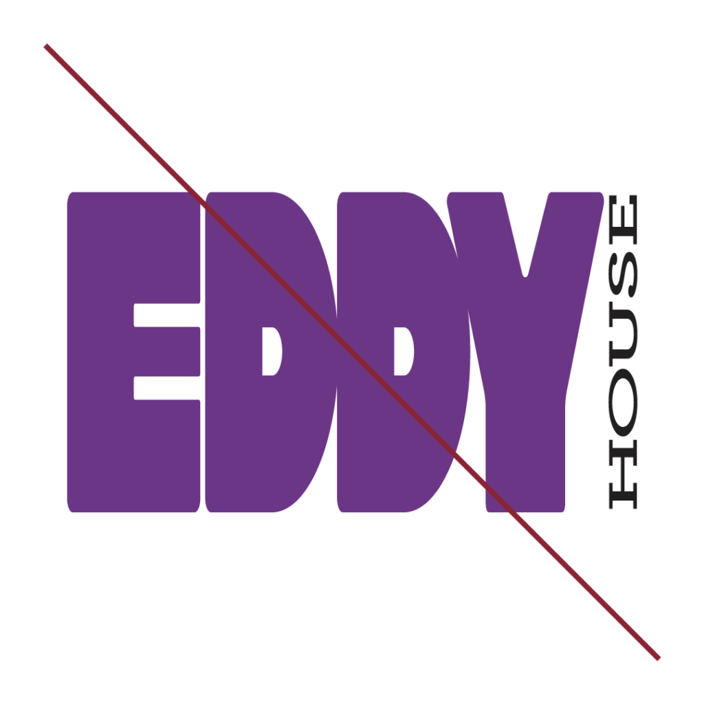
SKREW OR DISTORT
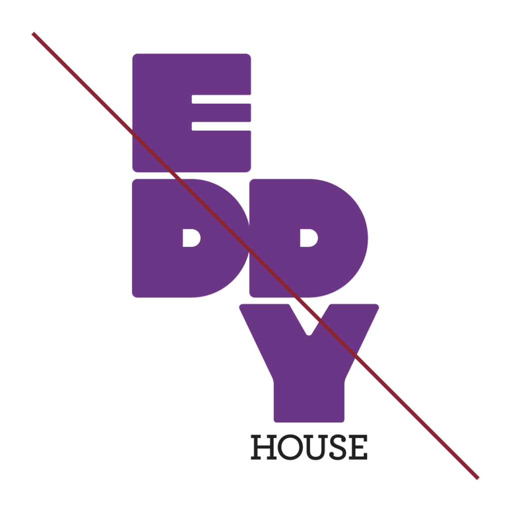
RE-ARRANGE ELEMENTS
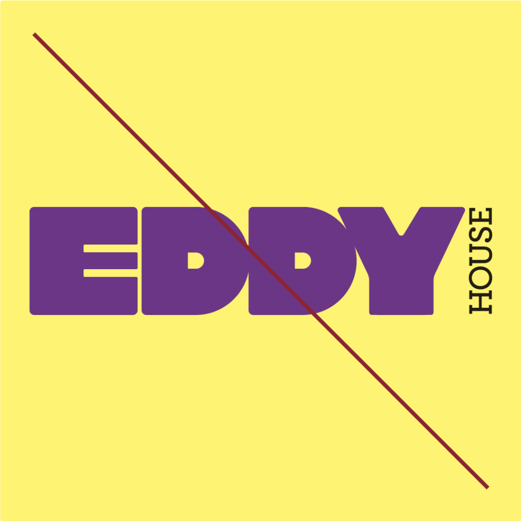
LAYER ON TOP OF COLOR
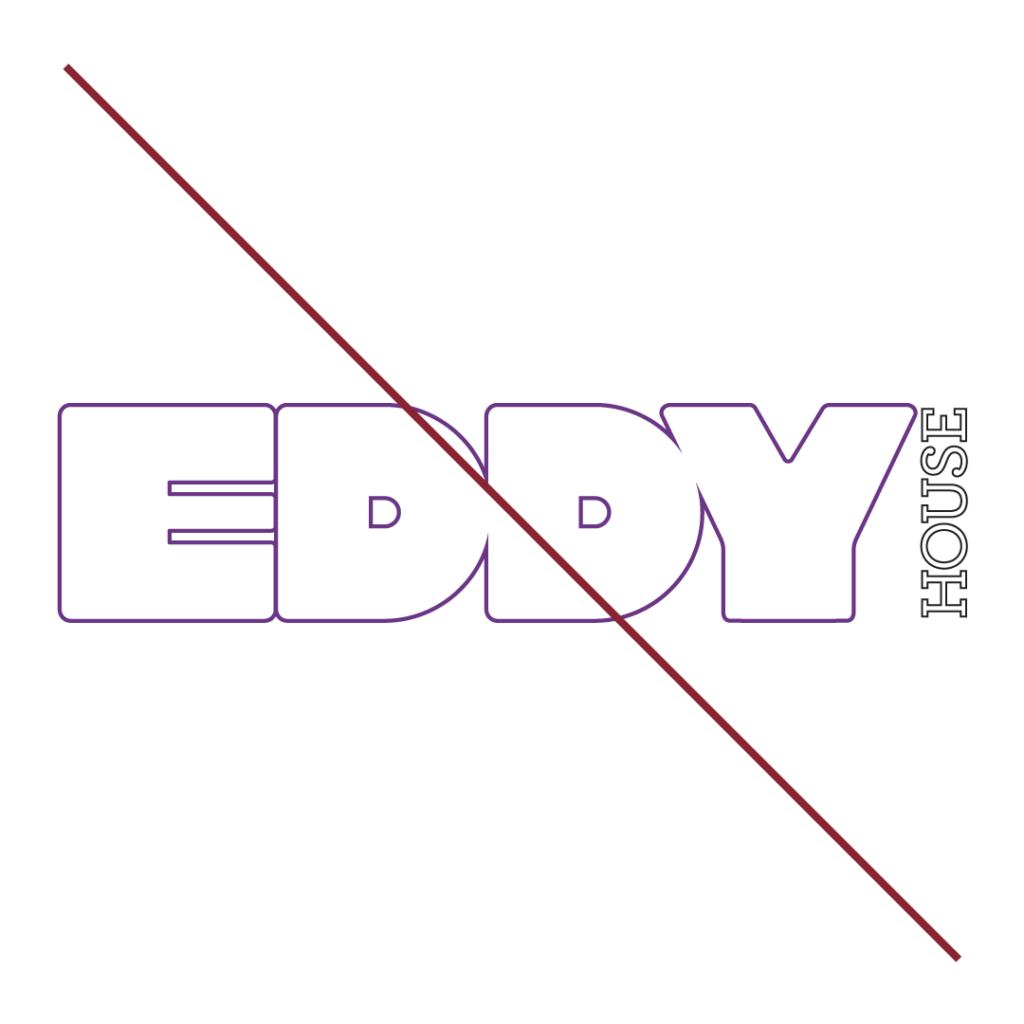
OUTLINE STROKE
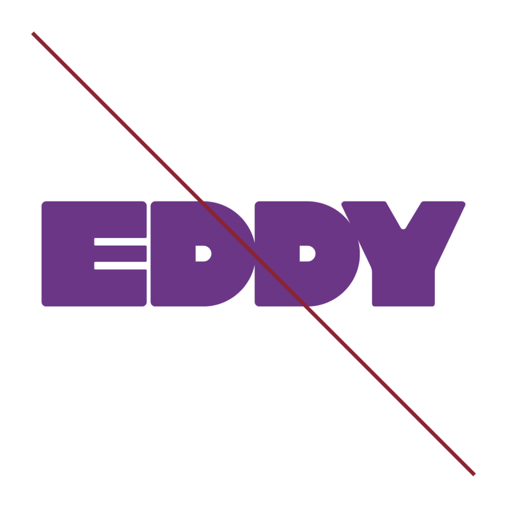
REMOVE ELEMENTS
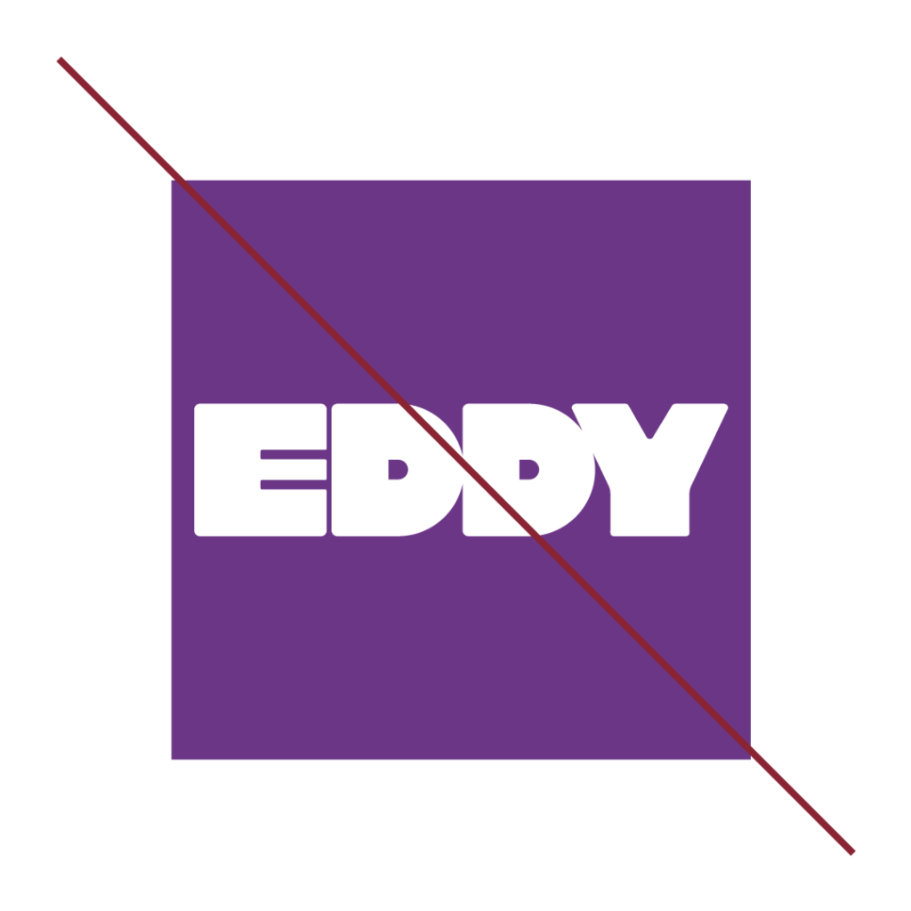
CHANGE ICON WORDMARK
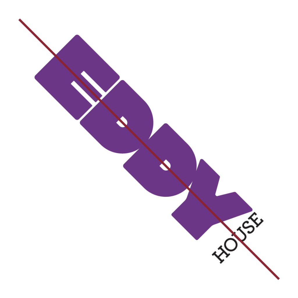
ROTATE LOGO
Section. 3 - Typography
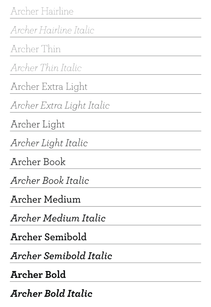
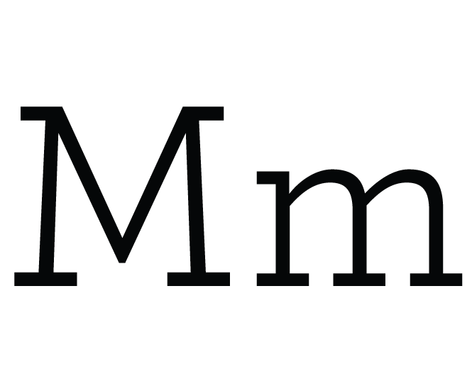
Primary – Archer Family
The Archer family is the primary font, as Eddy House utilizes its entire family. To be used in headlines, subheadings, small captions, body copy, etc.

Seconday – Helvetica 55 Roman
Helvetica is to be used for body copy, ideal for compact spaces while effortlessly conveying clarity across digital platforms and web applications.


Seconday – Arial
Arial serves the same purpose as Helvetica, to be used for body copy, ideal for compact spaces while effortlessly conveying clarity across digital platforms and web applications.

Section. 3 - Color & Gradients
Color Palette
Shown here is the main color palette for the Eddy House. The primary brand colors are Pantone 562 and 100% black. We use the 8 colors to create our gradients.
The colors should never be used outside of the values shown here. When utilizing a logo file, check to make sure that the color profile is appropriate given the usage. The following shows each color profile’s appropriate use:
- CMYK: Offset Process Printing, Digital Printing
- PMS: Offset Process Printing, Screen Printing
Learn More - HEX: Screen-Based Applications
- RGB: Screen-Based Applications

CMYK – 67,98,6,1
RGB – 107,53,132
PMS – 526 C
HEX – #6b3584

CMYK – 0,0,0,100
PMS – BLACK
HEX – #000000

CMYK – 20,81,0,0
RGB – 185,92,156
HEX – #ba5b9b

CMYK – 1,9,53,0
RGB – 250,226,153
HEX – #fae299

CMYK – 50,10,0,0
RGB – 133,189,229
HEX – #85bde5

CMYK – 0,50,11,0
RGB – 232,157,176
HEX – #e89dbo

CMYK – 42,42,0,0
RGB – 149,146,194
HEX – #9592c2

CMYK – 0,34,67,0
RGB – 241,181,116
HEX – #f1b574

CMYK – 44,9,25,0
RGB – 154,192,191
HEX – #9acobf

CMYK – 0,84,80,0
RGB – 223,92,72
HEX – #df5c48
Gradients
The Eddy House visual identity utilizes various gradients to symbolize their core values.
Primary gradients are featured at the top, while secondary gradients are positioned at the bottom. These gradients can be used for any aspect of the Eddy House identity, with none dedicated to a specific purpose.

Hope

Grit

Growth

Love

Collaboration (Unity)

Kindness

Dignity
