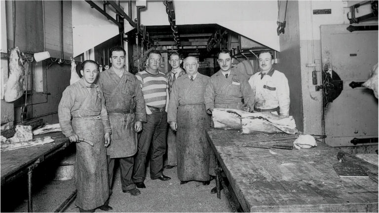
It starts with the Armando & Sons brand story. Every detail of this meat market and eatery is done out of respect to the men who started it all. We’re building the place Armando and his Sons could be proud of. A place that honors the Ranchers, Farmers, and Artisans who are passionate about food as we are. A place where we want everyone who walks through the door to feel like part of the family. A place that honors sustainable practices and farmers who champion them. A business that respects family so deeply that they treat every person that walks through the door like one of their own. Above all, Armando & Sons is unrelenting respect for quality. Through that, any success is possible.
Brand Tone
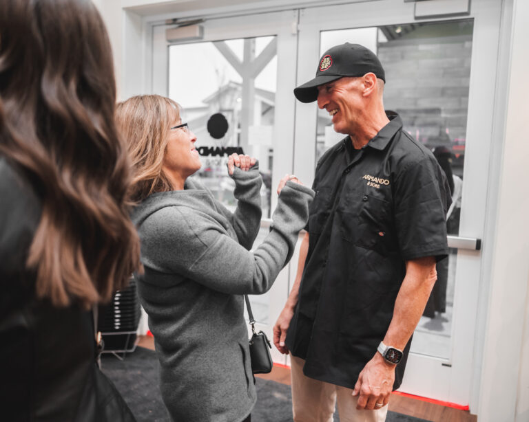
WARM- everyone who walks through our doors should feel at home. Everyone we interact with should feel at ease.
PLAYFUL- Just because we sell Wagyu doesn’t mean we’re stuffy and pretentious. Just like the old Italian butcher in our name, we put a smile on everyone’s face.
RESPECTFUL- Respect for the butchering craft extends to the people who keep us in business. Treat others kindly.
Brand Position
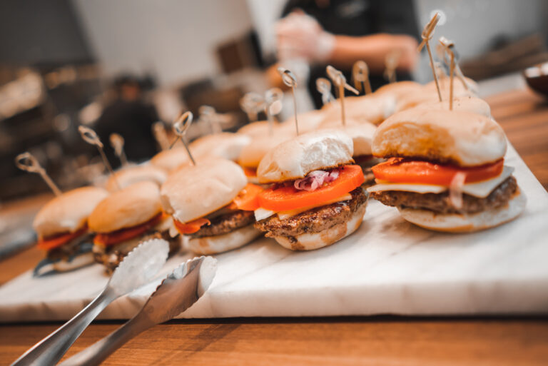
For anyone passionate about great meat and seafood Armando & Sons is the market that best delivers an elevated take on the neighborhood butcher shop because Armando & Sons, combines modern sensibilities with a deep respect for their family history of the butchering craft.
LOGO GUIDE
The Armando & Sons logo is the most prominent visual representation of the organization in all instances and should be presented consistently and accurately to build recognition of the brand and effectively reflect the company’s image and identity.
In the included folder you will find sub folders containing .eps/.ai/.pdf files .jpg and .png files. If a vendor requests vector art/Illustrator/high resolution files, supply the .eps/.ai/.pdf files. If they request raster art, .jpg, or .png, supply them with the .jpg and .png files.
The main elements of the Armando & Sons identity are pictured here. This includes the primary full-color logo, black logo, and secondary horizontal logo, wordmark, and icons. All artwork must be constructed from reproduction-quality art or from high-resolution digital files.
Horizontal Logo
Wordmark Logo
Icons
Section. 2 - Identity Usage
Safe Space
Each aspect of the identity must be treated properly as it is applied to design. Pictured right are the guidelines for safe space when utilizing the logo lockup. The space surrounding the logo should never be smaller than the height of half of the logo icon.
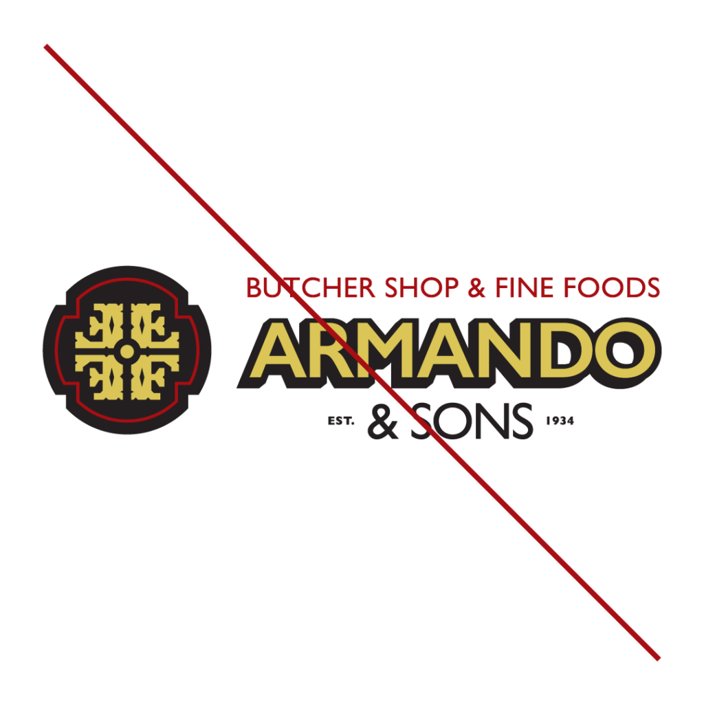
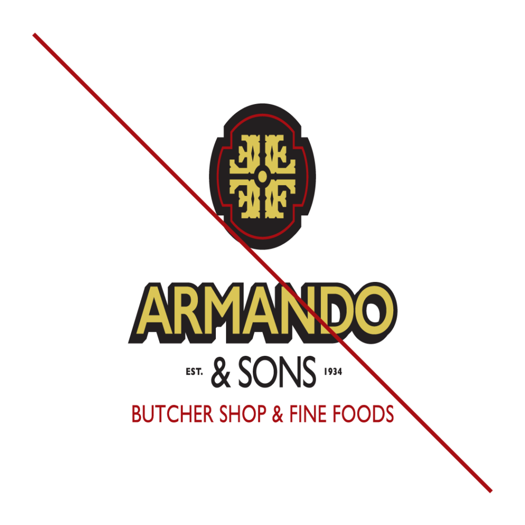
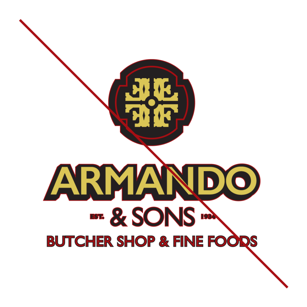
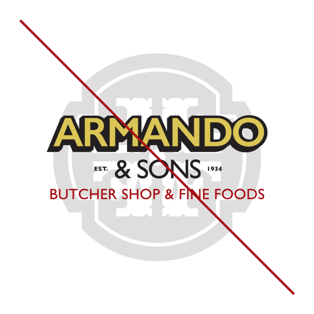
Misuses
The Armando & Sons logo should always be used in its original format or under the guidelines given. Never should the logo be treated in one of the methods shown here.
EMBELLISHING
ROTATING
ALTERING PROPORTIONS
NON-DESIGNATED COLORS
NON-DESIGNATED COLORS
REORDERING ELEMENTS
DISTORT OR SKEW
ADDING STROKE
LAYERING ELEMENTS
Section. 3 - Typography & Color
Typography – Primary
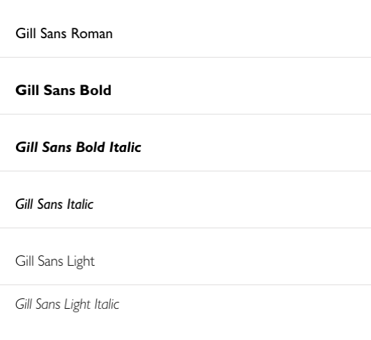
Gill Sans Family
Shown here is the primary typeface for Armando & Sons. Utilization includes headlines and subheads.
The acceptable weights for Primary uses are Gill Sans Roman, Bold, Bold Italic, Sans Italic, Sans Light, and Sans Light Italic.
Shown here is the main color palette for the Armando & Sons brand.
The colors should never be used outside of the values shown here. When utilizing a logo file, check to make sure that the color profile is appropriate given the usage. The following shows each color profile’s appropriate use:
CMYK: Offset Process Printing, Digital Printing
PMS: Offset Process Printing, Screen Printing Learn More